Check Out The Outlandish Number Of 2013 Movie Posters Involving Forests

There’s always a theme. Every single year, unintentionally, like ten or fifteen movie posters wind up rolling with the same color scheme, the same theme or even the same mood. Looking back at 2013, the year in movie posters has basically given us two different trends. The first, as pointed out by our own Eric Eisenberg involves characters turning their back to the camera, and the second, as you’re about to see involves something far stranger: the woods.
That’s right. For whatever reason, the Hollywood marketing machine fell head over heels with placing people in forests, jungles or wooded areas. Given their subject matter, a few of these films really needed to go there, but some of the others could have involved couches, beaches or classrooms and somehow still settled on a hardcore nature theme.
So, in honor of the years that was, let’s take a look back at fifteen of 2013’s most bark-filled and most environmentally friendly marketing campaigns.
Article continues belowAuthor’s Note: I’m going to use forest, jungle, woods and other names for tree-infested areas interchangeably, as if they’re all direct synonyms. I realize there are slight differences, but I’m not interested in writing forest eighty times during this article. Deal with it, Professor Sprout.
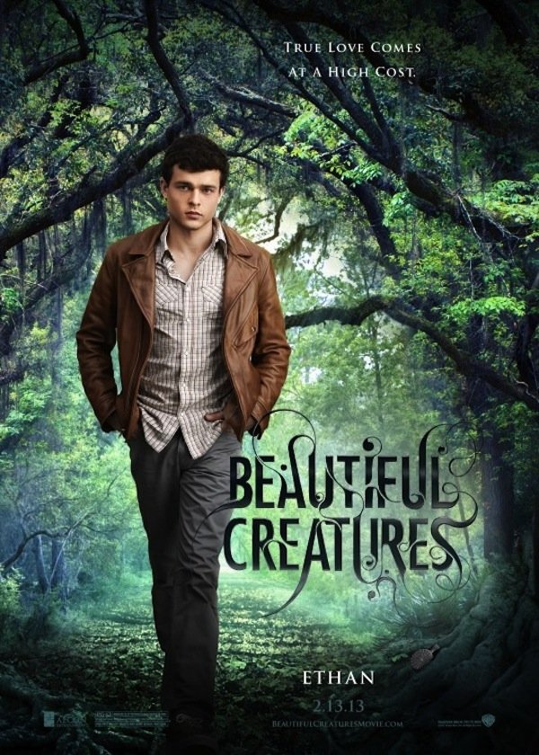
Beautiful Creatures
Background: Part of a series of character posters that feature the mains walking through the woods, this particular effort shows off Ethan’s pensive face. To further hammer home the natural theme, the letters in the movie’s title curve like vines, also letting the viewer know there’s going to be some sneakiness afoot. If you haven’t seen the film, there’s certainly plenty of that, as well as more than a few brooding, sad bastard looks like the one seen in the poster.
Overall Poster Rating: 6/10
Your Daily Blend of Entertainment News
Reason: The photoshop work here is okay, but the subject matter really doesn’t require a forest. Sure, there are some scenes filmed around trees, but much of the film also takes place in a library, various houses, a school and even a Civil War battlefield. Plus, I don’t really see how anything he has on is forest appropriate. Do people really traipse through nature in a brown leather jacket? I grew up in Chicago so the answers to these questions are a mystery to me.
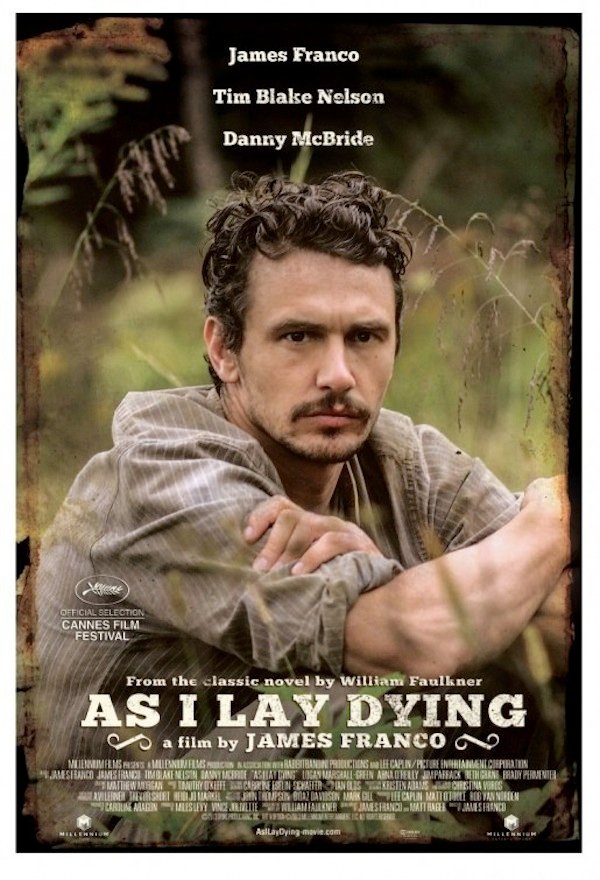
As I Lay Dying
Background: Recently, James Franco got excited about adapting William Faulkner’s As I Lay Dying. Why? Because he’s the type of guy that gets excited about doing weird shit—like selling invisible art. You probably heard about the adaptation at some point or another, but what you probably didn’t know is the film already came out. More importantly for our purposes, so did its poster, and it features Franco looking all intense while surrounded by some overgrowth.
Overall Poster Rating: 7/10
Reason: I’ve never read As I Lay Dying. In fact, I don’t even have the slightest idea what it’s about, but judging by this poster, I would say Franco’s character is an intense blue collar guy who works in or around the woods and has probably just experienced a terrible loss. Give me a minute to check with Wikipedia and verify. Checking. Checking. Checking. Wooo! I didn’t not see this level of heartbreak coming. Also, a forest does not figure heavily into the plot; so, I’m going to go back and knock the overall poster score down a point.
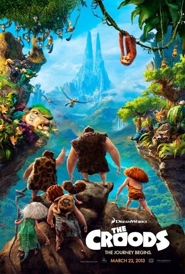
The Croods
Background: Beset by one of the worst names in modern cinematic memory, The Croods overcame that hurdle and netted almost six hundred million dollars worldwide, as well as a Golden Globe nomination. Much of that success can be attributed to the stellar animation, the wonderful voice cast and the clever writing, but I’d like to think at least a few of those millions are directly attributable to this beautiful and vibrant poster that cleverly uses one shot to basically get across the film’s entire plot: early humans leaving the security of the cave and entering the dangerous and beautiful tree-filled unknown.
Overall Poster Rating: 10/10
Reason: This is one of the nicest posters of the year. It’s colorful. It’s eye-grabbing. It’s simple yet really complicated if you take the time to look into the corners, and it would be weird if it didn’t include as much dense forestry and wilderness as possible. So, unlike some of these, the subject matter really does fit.
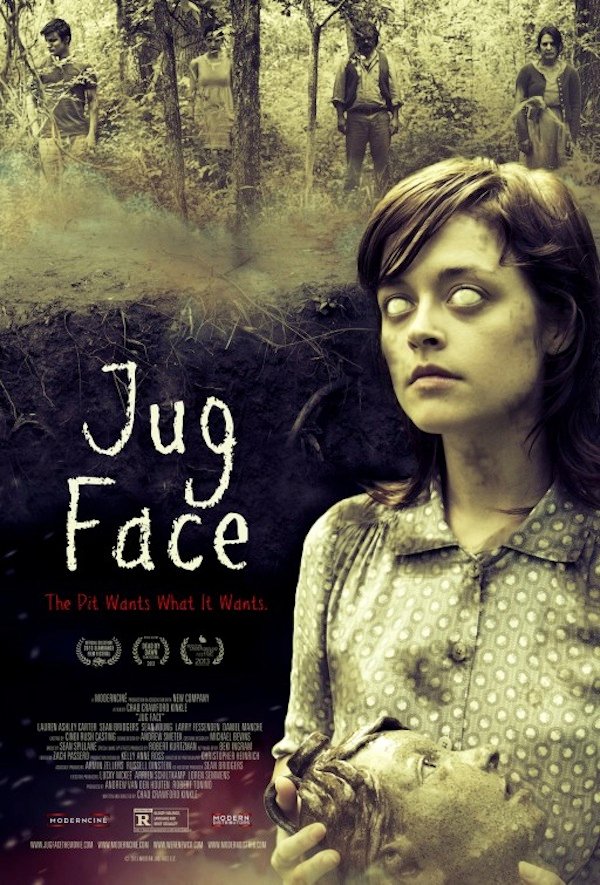
Jug Face
Background: Go ahead and say it with me. What in the photosynthesis bomb is that? We seem to have a freaky chick with no eyes who is cradling a statue inside a big hole while three random townsfolk and a demon look on. Is she possessed? Is she just crazy? The tagline reads "the Pit Wants What It Wants", but it’s unclear to me whether she’s the pit or this mysterious pit swallowed her eyes and she’s merely comforting the statue that fell in alongside her. Is she a victim or not? I need answers to these questions right now.
Overall Poster Rating: 7/10
Reason: I’m intrigued. I like the way the poster uses her in the foreground to illustrate she’s inside the pit, and I like the way it mutes the wilderness green colors a bit so the viewer’s eyes aren’t immediately drawn to the background instead, yet keeps enough of the trees as to not obscure the location. The world needs to know this pit is inside a forest and that others seem to have at least a vague idea of where it is.
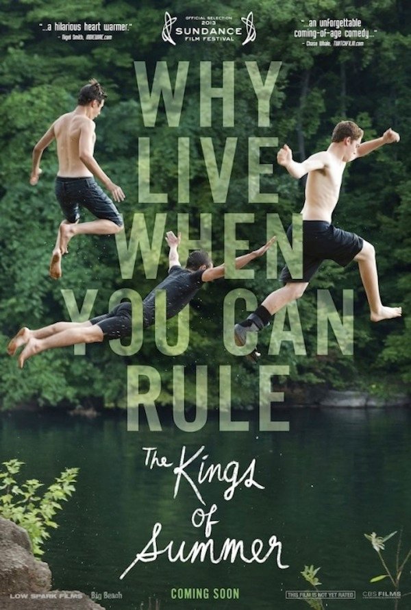
Kings Of Summer
Background: One of the standouts at the Sundance Film Festival, Kings Of Summer follows a group of boys who spend the more pleasant months of the year living inside a house in the woods. Naturally, the advertisement for such a plot contains a nice little shot of that wooded area, in this case in the background as the lead characters jump off an embankment and into the water below. Vaguely dangerous activities for the win.
Overall Poster Rating: 7/10
Reason: I’m not a big fan of giant letters across the middle of a poster. The physics of how the jumpers are in front of some letters and behind other letters is also really weirding me out, but I do appreciate that the poster conveys a very good time is being had and it uses green letters to further illustrate just how much nature will be involved in the movie.
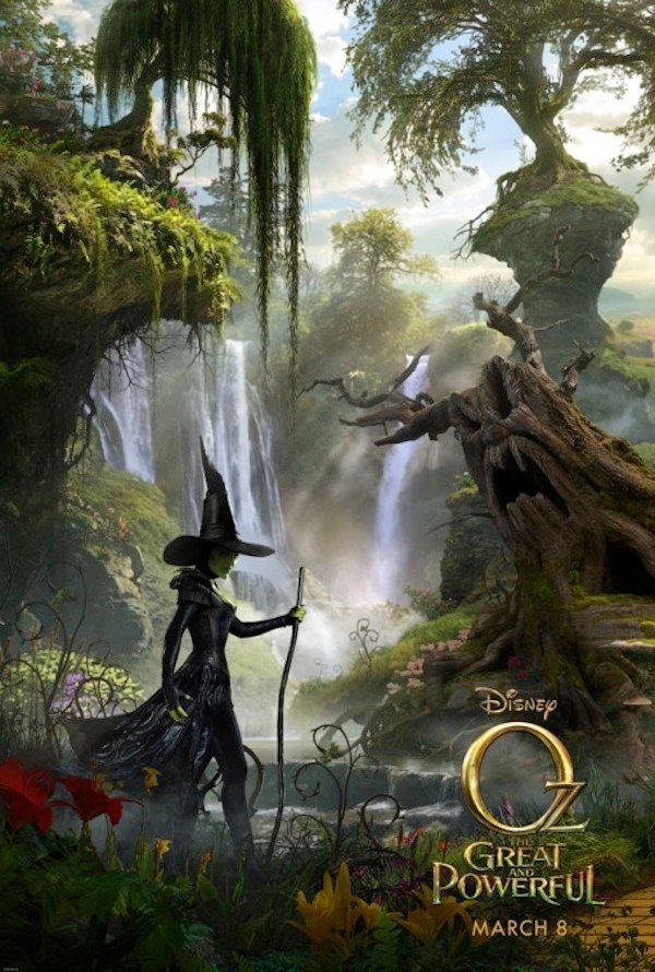
Oz: The Great And Powerful
Background: I’m not going to sit here and praise everything about Oz: The Great And Powerful. That movie has some gigantic issues, but exactly none of them have to do with anything visual. In fact, there’s not a single movie that came out this year that’s more of a treat for the eyes. It’s wall-to-wall CGI-enhanced beauty, and this poster does a pretty good job of showing that. It works in a lot of foliage, some aggressively colorful flowers and a lot of overhanging branches and vines.
Overall Poster Rating: 10/10
Reason: This poster is great. I already wasted a portion of my life watching the film, but staring at this tribute to nature’s glory makes me want to sit through the mixed bag again. I should also give a shout-out to the waterfall, which was definitely a minor theme this year in a wide variety of posters from this one to Oblivion and a second shout-out to the tree that seems to be trying to scream the identity of the Wicked Witch that was played so close to the vest.
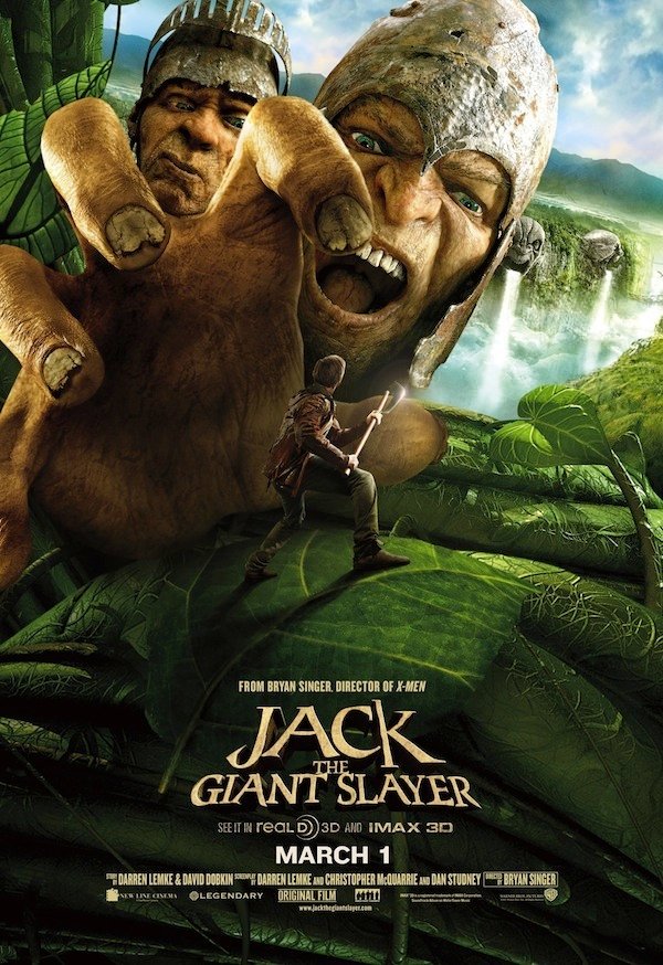
Jack The Giant Slayer
Background: I’m going to be honest. Even if this trailer was just one giant beanstalk coming out of a highway, I probably would have put it on this list. I have a long history of bending the rules to fit my purposes, but luckily, that’s not an issue here. There’s nature infecting damn near every portion of this slightly above average poster. I especially enjoy the running waterfall (recurring theme) in the background and the mountains in the distance. The land represented might be crawling with monsters, but it’s also brimming with natural resources.
Overall Poster Rating: 6/10
Reason: I appreciate that Bryan Singer and company were trying to go for an action shot here on the poster, but the choice makes me think the entire movie is going to be about a giant running through the forest and trying to pick up our little tiny hero with his big oafish hands. That’s really not that exciting. Besides, I’m confused about the leaf sizes. Are these trees like ten thousand feet tall or how does that work? Because most trees are already giant-sized, and their leaves aren’t really that big.
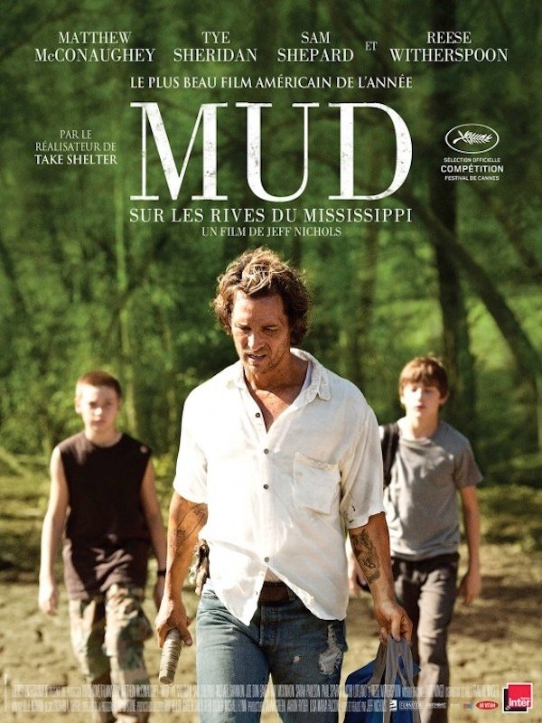
Mud
Background: Mud is one of the best movies you didn’t see this year. It features a dynamite performance from Matthew McConaughey and some knockouts from kids you’ve never heard of. It also takes place in Bumfuck, USA and involves a houseboat that got stuck inside a tree in the middle of the forest. How in God’s name the American version of the poster doesn't feature at least something in the way of photosynthesis is beyond me, but thankfully, this foreign version comes through big time with all the mains walking away from the forest in question.
Overall Poster Rating: 5/10
Reason: It’s a little bit generic for my taste. If I was hit in the head and lost all memory of this movie, I wouldn’t have the slightest idea what the hell it was about judging by the poster and the movie’s name which expresses almost nothing. I would probably think it was about a shady father taking his redneck kids on a trip to see their birth mother.
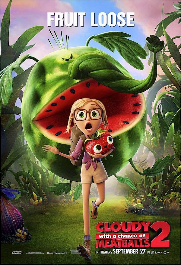
Cloudy With A Chance Of Meatballs 2
Background: You scared? I certainly am. This woman is about to get eaten, crushed or both by a delicious watermelon, and if she dies, there’s not going to be anyone to tend to that beautiful greenery in the background. That’s a problem. Luckily for everyone involved with Cloudy 2, this poster certainly isn’t. In fact, it’s oddly beautiful, very visually appealing and judging by the rest of this list, on trend.
Overall Poster Rating: 8/10
Reason: I love the way the vine hooks out like an obnoxious nose, and I love the collective looks on everyone’s faces. There’s a whole lot of abject terror going on, and it makes me wants to see the film immediately, even if I somehow missed round one that everyone claims is highly underrated and worth a watch. Maybe that’s what I’ll do this afternoon. Nah. I'll probably eat watermelon instead.
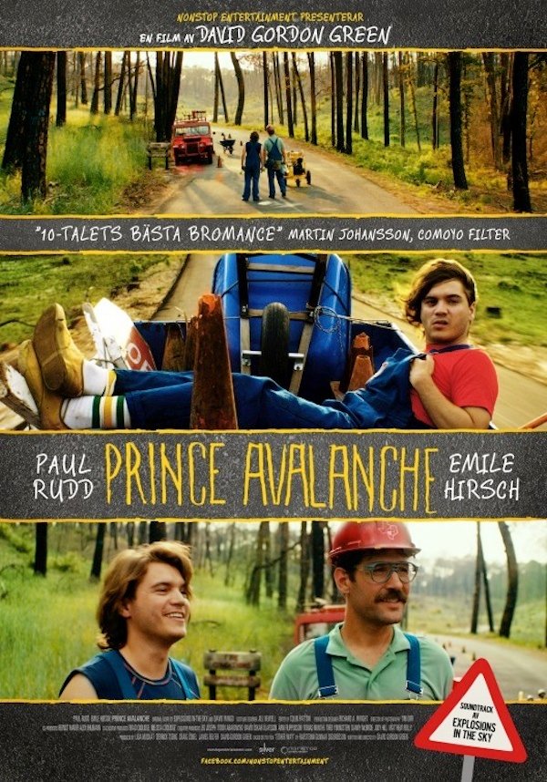
Prince Avalanche
Background: Why didn’t this play to a wider audience? I don’t understand. David Gordon Green is the dude who directed Your Highness and Pineapple Express, and most of us are more than familiar with the exploits of Paul Rudd and Emile Hirsch. Here, they seem to be playing farmers or maybe semi-professional loggers. I’m not really sure, but whatever they’re doing, it involves being outdoorsy in the woods with overalls on, subject matter rife for hilarity.
Overall Poster Rating: 4/10
Reason: This poster makes me think this film has potential, but it in no way makes me want to actually see the movie. Indie movies need to have incredible reviews, great word of mouth, an awesome promotional campaign or a famous actress getting naked in new and exciting ways to draw a crowd. This one seems to have none of that, though I do appreciate it does give us three times as many forest shots as most of the others.
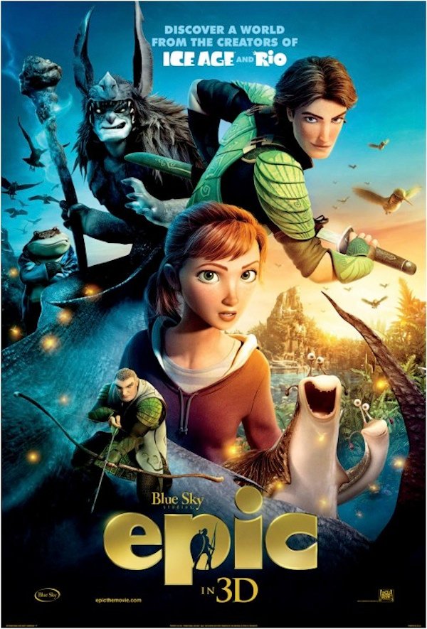
Epic
Background: Epic follows a bunch of little people and creatures hanging out in the woods and battling other little creatures hanging out in the woods. There’s also some science involved, but in general, it’s mostly woodsy action and some hard sells on environmentalism. As such, you would think the poster would really throw the forest out front and center, but it basically just slaps it on in the background in favor of depicting characters viewers have never met before. I can’t get on board with that.
Overall Poster Rating: 3/10
Reason: I know what you’re thinking. Why didn’t you just choose one of the other posters that contains more nature shots? Well, those don’t really exist. There are a few others that have like twenty percent more nature, but there’s not a single one that really gets down and dirty with trees, leaves, bushes, vines, blades of grass or even shrubbery. It should be noted however that I do think I see a waterfall way in the background, which is good for another running theme point.
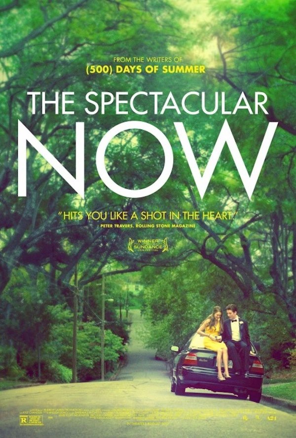
Spectacular Now
Background: Does this count? I think it does. Yes, they’re sitting on top of a car which is entirely conventional, but they could be in someone’s driveway. They could be at a park. They could be doing the same thing anywhere, but the marketing geniuses decided the background needed to be a heavily wooded area filled with a ton of trees. And why not? Clearly all the cool movies are doing it, and the scenery gives the larger snapshot an air of importance, class and elegance. I’m all for it. Besides, this movie fucking owns. You should go see it immediately, just don’t get too excited about witnessing obscure plantlife or shit like that. Almost all of the film’s runtime involves people talking, usually inside a building or in some location where they aren’t likely to get Lyme disease.
Overall Poster Rating: 7/10
Reason: This poster is cool. It’s not trying too hard. It’s not being pushy. It’s just laying out the basic storyline, which is girl and boy hang out and try to make love happen while driving around in mediocre cars and dreaming of living in places surrounded by less trees.
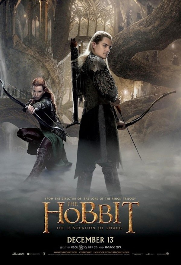
The Hobbit: Desolation Of Smaug
Background: There are actually a ton of Hobbit posters that take place in wooded areas, but most of them are really weird sizes; so, I had to go with this one that features a tree bending in all sorts of odd, unnatural directions. There also seems to be quite a bit of underbrush in the background and maybe even some trees off into the distance. Altogether, it’s a nature scene, and that’s how we’re going to count it.
Overall Poster Rating: 7/10
Reason: I would see this movie based on this poster. It’s very clear there’s a whole lot of interesting shit going on with the visuals, and I’m always a sucker for elves/ archers/ Olympic events involving shooting weird things. Beyond that, I’ll also dish out some bonus points for the weird fog ground that obscures their feet. I have no idea if that’s exclusively a Middle Earth thing, but I like it and it should migrate to California.
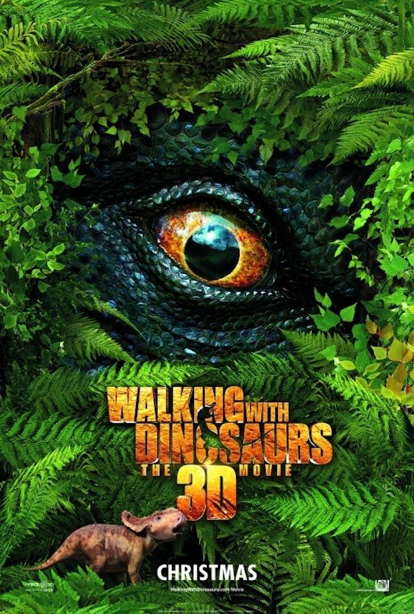
Walking With Dinosaurs
Background: The jury is still out as to whether the larger film will offer anything of value, but the poster for Walking With Dinosaurs is pretty terrifying. It features a one creepy dinosaur eye peering through a jungle of leaves and another little baby dinosaur that may or may not be seconds away from a deadly camouflage ambush. No doubt that scenario happened all of the time back in the day, and I really, really want to witness it on film.
Overall Poster Rating: 9/10
Reason: Sometimes less is more. The basic premise behind Walking With Dinosaurs is remarkably simple. It’s pitching dinosaurs in 3D, and who the hell wouldn’t want to see this dinosaur emerge from the forest and beast on some unsuspecting creatures a little lower on the food chain? This poster promises that without using a ton of words, and given the vibrancy of the green leaves, it also promises a very visual treat filled with above average graphics.
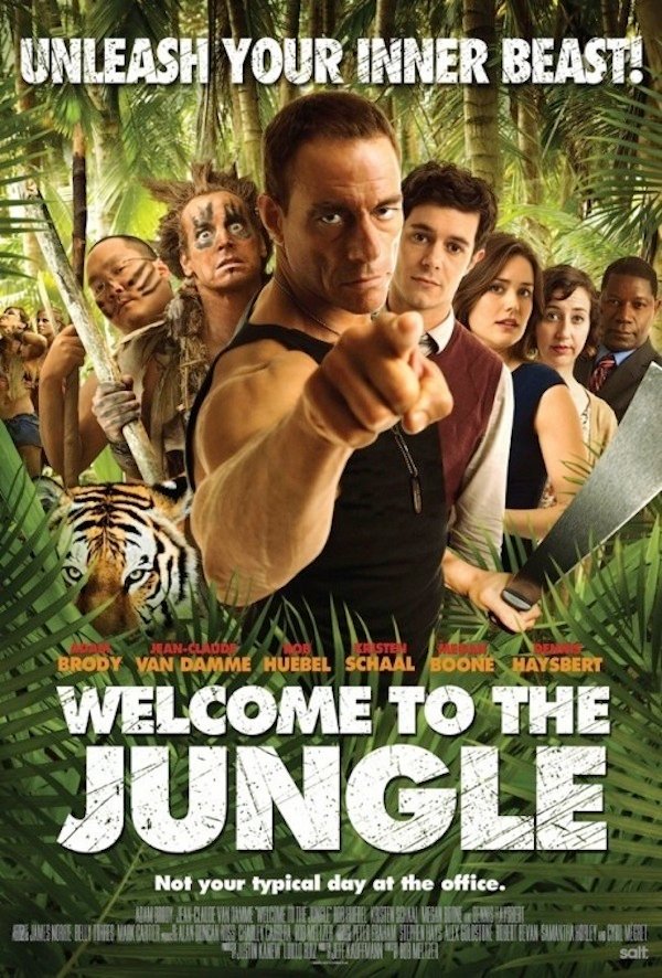
Welcome To The Jungle
Background: First of all, why the hell didn’t I get a memo explaining this movie was coming out? It apparently dropped back in April, and it’s so inside my wheelhouse it’s not even funny. I love me some JCVD, and beyond him, I love the chick with the weird voice who says, "It’s just a dinosaur" in Toy Story 3 and I love the Allstate Guy who sounds like he’s God’s mouthpiece. I need to go out and find this movie immediately. Second of all, there’s a ton of nature crammed into this tiny poster, which is impressive considering I count 9 characters. Well played, marketing crew.
Overall Poster Rating: 8/10
Reason: This poster is perfect for a B movie. I have no idea whether those involved were trying to make something tongue-in-cheek, but either way, I’m sold. There seems to be underlying racism, gruesome death scenes and maybe some bizarre animal attacks directly related to the setting. I want to sign up right now.
Mack Rawden is the Editor-In-Chief of CinemaBlend. He first started working at the publication as a writer back in 2007 and has held various jobs at the site in the time since including Managing Editor, Pop Culture Editor and Staff Writer. He now splits his time between working on CinemaBlend’s user experience, helping to plan the site’s editorial direction and writing passionate articles about niche entertainment topics he’s into. He graduated from Indiana University with a degree in English (go Hoosiers!) and has been interviewed and quoted in a variety of publications including Digiday. Enthusiastic about Clue, case-of-the-week mysteries, a great wrestling promo and cookies at Disney World. Less enthusiastic about the pricing structure of cable, loud noises and Tuesdays.
