The Transformers 2 Poster That Should Have Been

Your Daily Blend of Entertainment News
You are now subscribed
Your newsletter sign-up was successful
We’ve had a flood of great video footage and news on Paramount’s upcoming Transformers sequel Revenge of the Fallen since the Super Bowl, and the movie, if you’re a fan of giant freakin robots, looks good. One very small problem though: The movie’s teaser poster sucks.
I know, it doesn’t matter. At this point Transformers is so huge that they could just as easily have put out a blank sheet of paper with “TF2” on it and achieved all the marketing muster they’re looking for. But if you’re going to put out a poster, why not put out a good one? That’s it there to your right. What the hell is that?
I get what they’re doing here. The very first teaser posters for the original movie were simply the Autobot and Decepticon logos on a black background. That worked, because those logos are already somewhat iconic. When anybody who grew up in the 80s sees that symbol, they automatically know what it means. It was also critical to their marketing campaign since, at the time we hadn’t really gotten a good look at what a Michael Bay transforming robot looked like. Since they wanted to keep the robots under wraps, they had nothing but a logo to show us. It made sense. Now that robo-cherry has been popped, yet they’ve still attempted something similar for the sequel, only the this time the logo in question is, I assume, a symbol meant to represent the titular Fallen.
One problem: No one knows what the heck a Fallen is. It means nothing to us and even if it did we aren’t showing up to this movie to see them. We’re there for Autobots. Decepticons. Optimus Prime. Bumblebee. Not this vague, spikey, whatever it is they’ve plastered on the poster. It doesn’t matter of course, how good or bad the one sheet is will have no bearing on whether or not this movie is a success or whether it’s actually good. But if you’re going to put out a poster, I say why not make it a good one?
For me this is perhaps a little more annoying than it is for most. I’m forced to encounter this vague, meaningless poster on a daily basis as I struggle to find interesting images to include with our various Transformers stories. Since it’s still early in the film’s marketing cycle, this poster is really the only thing out there representing the movie, and I’m forced to use it over and over and over again. No amount of creative cropping helps it, and so because I’m forced to use it you’re all forced to look at it over and over and over again.
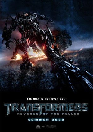
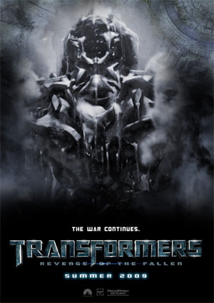
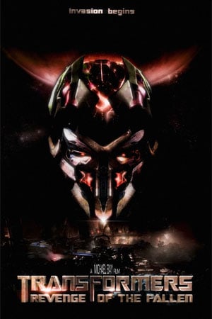
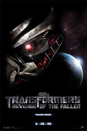
Enough. At some point Paramount is going to put out a new batch of promotional posters for the film. When they do it’s critical, if only for my sanity and yours, that they give us something that won’t look like a meaningless, black, blotch on our computer monitors. Below I’ve posted a couple of brilliant suggestions, created by fans. This Paramount, is what you should have done. Click on each one to see them bigger, and hey Paramount, consider using these as a template whenever you get around to putting our your next batch of Revenge of the Fallen posters:
Your Daily Blend of Entertainment News

