Harry Potter
Latest about Harry Potter

John Lithgow Accepts People Are Now Going To Bring Up J.K. Rowling Controversy In ‘Every Interview’ Forever
By Erik Swann published
Lithgow discussed his Harry Potter casting again.

I Can’t Get Over Daniel Radcliffe Calling Out The Harry Potter Gaffe In The Devil Wears Prada
By Ryan LaBee published
Now that Radcliffe mentions it, that does seem impossible.
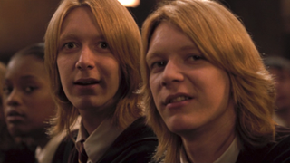
I Still Can't Believe The Phelps Twins Are 40, But Harry Potter's Tom Felton Had The Perfect Reaction
By Mick Joest published
Gotta love a leopard that won't change his spots.

HBO Max Is The Home Of Harry Potter, But It’s Tom Felton’s New Movie That’s No. 1 On The Charts
By Emma Lambiaso published
Do we have a new spoof classic on our hands?

The Personal Reason Harry Potter’s Katie Leung Wouldn’t Want To Relive Her Time With The Franchise
By Carly Levy published
I see her point.
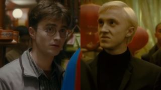
Lumos! See Daniel Radcliffe And Tom Felton Light Up Their Very Harry Potter Broadway Reunion
By Riley Utley published
These photos deserve a standing ovation.

Daniel Radcliffe Revealed The Projects He's Most Recognized For Outside Of Harry Potter (And One Of Them He's Not Even In)
By Dirk Libbey published
These are great movies too.
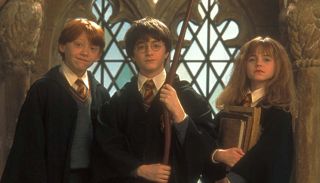
One Big Thing Daniel Radcliffe, Rupert Grint And Emma Watson Are Bonding Over As New Harry Potter Series Films
By Emma Lambiaso published
A passing of the torch.
CINEMABLEND NEWSLETTER
Your Daily Blend of Entertainment News
LATEST ARTICLES
