-
-
 Is God Is Reviews Are Here, And Critics Are Saying The Same Thing About This ‘Rage-Filled’ Thriller
 -
 The Batman Part II Dropped Its First Look At Scarlett Johansson, And Fans Think They Figured Out Who She's Playing
 -
 Upcoming Movies In 2026: New Movie Release Dates
 -
 Jennifer Lopez Thought She Had Ted Lasso's Brett Goldstein Figured Out. How He Surprised Her In New Netflix Rom-Com
 -
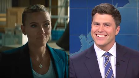 Colin Jost Revealed The Unexpected (And Funny) Challenge Scarlett Johansson's Fame Causes For Them
 -
 M. Night Shyamalan Is Testing His Latest Movie, And One Hot Fact Has Me Hyped
 -
 Florence Pugh Gets Real About Releasing Avengers: Doomsday And Dune: Part Three On The Same Day After Taking A Lot Of Time Off
-


-
-
 The Devil Wears Prada 2 Uppercuts Mortal Kombat II At The Box Office, But Michael Boasts The Weekend’s Biggest Win
 -
 Why The Devil Wears Prada 2’s Box Office Debut Win Was Such A Slay For Meryl Streep And Emily Blunt
 -
 Michael Told Mario To Beat It, As King Of Pop Biopic Dances All Over Box Office Records
 -
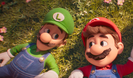 The Super Mario Galaxy Movie Takes Its Box Office Dominance Global, But What Does That Mean For New Releases?
 -
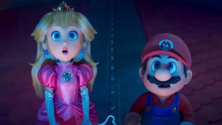 The Super Mario Galaxy Movie Hit More Milestones At The Box Office... But Is $1 Billion Happening?
 -
 The Super Mario Galaxy Movie Just Had The Biggest Box Office Opening Weekend Of 2026 But Fell Short In One Key Way
 -
 Project Hail Mary Had An Awesome Second Weekend At The Box Office And Crossed Another Big Milestone
 -
 Project Hail Mary Has A Stellar Debut At The Weekend Box Office While Ready Or Not 2 Fails To Slay
 -
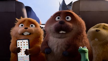 Hoppers Has A Spectacular Second Weekend At The Box Office While Reminders Of Him Settles For Second
-


-
-
 Singin' In The Rain Is 74 Years Old And Still The Greatest Movie Musical Of All Time. Here's Why
 -
 Upcoming Video Game Movies And Shows I Can’t Wait To See In 2026 And Beyond – Mortal Kombat II, Street Fighter And More
 -
 Michael Was Fun, But Can We Get A Janet Jackson Movie Next, Please?
 -
 Upcoming Horror Movies: All The New Scary Movies Coming Out In 2026 And Beyond
 -
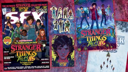 New IssueGet Some Great Stranger Things: Tales From '85 Gifts With The Latest Issue Of SFX
 -
 Upcoming Book-To-Screen Adaptations: What To Read Before The Movie Or TV Show
 -
 The Best Free Movies Online And Where To Watch Them
 -
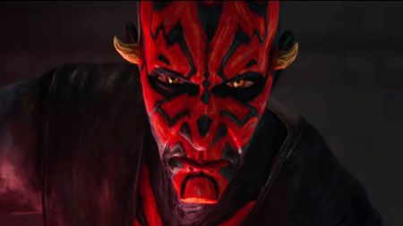 Upcoming Star Wars Movies And TV Shows
 -
 Upcoming Stephen King Movies, TV Miniseries And More
-


